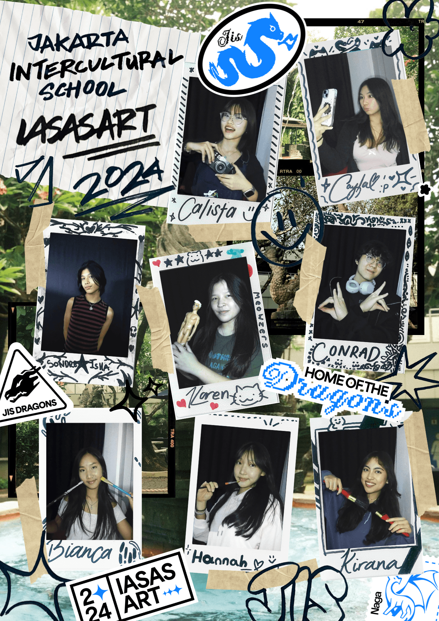
I have a passion creating playful designs and a love for everything cute₊˚⊹ ᢉ𐭩
.𖡼.𖤣𖥧෴.𖤣.𖡼.𖤣𖥧෴.𖡼.𖤣𖥧෴.𖤣.༻
I have a passion creating playful designs and a love for everything cute₊˚⊹ ᢉ𐭩
I have a passion creating playful designs and a love for everything cute₊˚⊹ ᢉ𐭩
.𖡼.𖤣𖥧෴.𖤣.𖡼.𖤣𖥧෴.𖡼.𖤣𖥧෴.𖤣.༻

Applications Used
Adobe Illustrator
Purpose
Class Assignment
Size
11 x 17in
Explore the Univers.
Sept 2026
“Explore the Univers.” is a series of three posters designed as type specimens for Univers, a typeface designed by Adrian Frutiger. Each poster explores a different aspect of the typeface: history, form, and future. While each poster has its own visual language, a consistent border, color palette, and the tagline “Explore the Univers.” unify the series.
The first poster, focused on history, explores Univers through the lens of scientific classification. I took the modular table system featuring Univers’ 13 type styles and extrapolated it into a periodic table-inspired layout. Continuing the scientific theme, I incorporated visual elements inspired by the electromagnetic spectrum, creating an overall aesthetic reminiscent of a science textbook. The tagline, “Explore the Univers. Explore its elements.”, reinforces the idea of breaking the typeface down into its individual components.
The second poster, focused on form, explores Univers’ classification as a refined sans-serif and its humanist qualities. Its soft terminals, open apertures, and emphasis on legibility contribute to its approachable form. I used the phrase “Follow its flow.” to emphasize these qualities, creating structured borders that originate from the i in “Univers.” The poster also showcases the typeface’s extensive range of weights, including its condensed and expanded variations, highlighting the flexibility within its highly structured system.
The third poster, focused on future, reimagines Univers in a playful and unconventional setting. Although Univers is often associated with corporate and institutional design, I wanted to challenge this perception by placing it in a classroom environment. The poster is based on the pangram “A New York Times crossword puzzle stumped Jeff, leaving him with six blank squares.” Rather than using a traditional pangram such as “The quick brown fox jumps over the lazy dog” or the more typographically unusual “Cwm fjord bank glyphs vext quiz,” I chose a sentence that feels more contemporary and playful. The classroom-inspired composition demonstrates how Univers can function outside of the formal contexts it is typically associated with.
“Explore the Univers.” is a series of three posters designed as type specimens for Univers, a typeface designed by Adrian Frutiger. Each poster explores a different aspect of the typeface: history, form, and future. While each poster has its own visual language, a consistent border, color palette, and the tagline “Explore the Univers.” unify the series.
The first poster, focused on history, explores Univers through the lens of scientific classification. I took the modular table system featuring Univers’ 13 type styles and extrapolated it into a periodic table-inspired layout. Continuing the scientific theme, I incorporated visual elements inspired by the electromagnetic spectrum, creating an overall aesthetic reminiscent of a science textbook. The tagline, “Explore the Univers. Explore its elements.”, reinforces the idea of breaking the typeface down into its individual components.
The second poster, focused on form, explores Univers’ classification as a refined sans-serif and its humanist qualities. Its soft terminals, open apertures, and emphasis on legibility contribute to its approachable form. I used the phrase “Follow its flow.” to emphasize these qualities, creating structured borders that originate from the i in “Univers.” The poster also showcases the typeface’s extensive range of weights, including its condensed and expanded variations, highlighting the flexibility within its highly structured system.
The third poster, focused on future, reimagines Univers in a playful and unconventional setting. Although Univers is often associated with corporate and institutional design, I wanted to challenge this perception by placing it in a classroom environment. The poster is based on the pangram “A New York Times crossword puzzle stumped Jeff, leaving him with six blank squares.” Rather than using a traditional pangram such as “The quick brown fox jumps over the lazy dog” or the more typographically unusual “Cwm fjord bank glyphs vext quiz,” I chose a sentence that feels more contemporary and playful. The classroom-inspired composition demonstrates how Univers can function outside of the formal contexts it is typically associated with.


OTHER PROJECTS